After receiving my OGR Feedback, I have wanted to address the key focal points in which I want my style to be. I am aiming for a futuristic approach to the '20,000 Leagues Under the Sea' novel and this to be incorporated into all three of my scenes.
The Library - A 'Modern' Touch
After looking back at my Library thumbnails, they don't seem very expressive or imaginary. I focused to much about illustrations for the book rather then using them for inspiration. This resulted with the rest of my other thumbnails as well, so I've decided to re-think things.
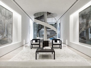
This is the overall feel to the library I now want. Clean, crisp edges and rightful perspectives. For example; either side could incorporate bookshelves and one wall could be made out of glass looking out into the ocean. i.e.; Tropical fish or sea creatures.
The Submarine Forest - 'Wild Side'
My first ideas for this underwater 'rain forest' scene was quite generic in terms of style and scenery. So larger could certainly be better, however I still need to remember the principles of the foreground midground and background.
Using this specific Concept painting from the film, 'Avatar' I can get a sense of depth and realism. The image shows the intensity of the forest with illuminating colours and bright lights that seem to continue throughout the darkness. This is what I am hoping to achieve for this scene as the book gives a very descriptive view about colours and shapes of the vegetation.
The 'Mystery' Third Scene
From my feedback and looking professionally at my designs, the original 'Sea Spider Attack' scene would not have been suitable for this brief. As the brief states, our concept art has to resemble a 'Cinematic Space'; where as I understand now how this particular scene was just highlighting the point of this huge spider. So over the weekend, I'll be producing more traditional thumbnails ready to take forward digitally Monday, so by then I will have decided on a more suited scene to which my ideas can be furthered.
Bibliography:
Modern Interior Design:
http://www.paseoner.com/interior-home-design-inspiration-in-55-blair-road/spiral-staircase-with-black-table-and-chair-for-white-home-interior/
Avatar Concept Art:
http://www.picstopin.com/800/avatar-concept-art/http:%7C%7Ci*neoseeker*com%7Cca%7Cjames_camerons_avatar_conceptart_mx3Gb*jpg/


a really positive clarifying post, Heidi - well done - and now, 'onwards!' :)
ReplyDelete