Friday, 22 July 2016
Sunday, 3 July 2016
Wednesday, 8 June 2016
@Phil ND: 5/7 Images
ND: 5/7 Images
I have these images that I feel might work for me in ND. I have also listed below what I plan to do for the other images. I was going with the idea of having images that show my progress but also other ideas I had.
@Phil What about colour? Feels like I should either leave them black and white or have something similar to the colours in the Beast design poster? Should I improve on the colours of the Beast? Or should I have a colour theme running through all the images?
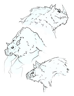
Poster 6: Wireframe of Beast
Tuesday, 17 May 2016
@Alan/Phil Post Hand-In: Silver's Design and Head Model Improvements
Silver's Design and Head Model Improvements
After taking a step back from my project and now knowing I have more time to focus on my characters, I really wanted to improve on them. My major concern with my project was the character Silver. Her overall design wasn't right for the world she belongs to in comparison to the other characters.
After taking a step back from my project and now knowing I have more time to focus on my characters, I really wanted to improve on them. My major concern with my project was the character Silver. Her overall design wasn't right for the world she belongs to in comparison to the other characters.
http://www.cgmeetup.net/home/tips-tricks-related-facial-modeling-animated-productions/
As I wanted to increase the realism in Silver's model to match the other characters, I found a great set of videos showing a process of modelling characters for animation. So along side the tutorials by Alan, I have started to remodel Silvers head (for fun, too) with having higher realism in mind.
I have thought of a more creative way to express the use of these silver hands and how I can use them to my benefit, rather than a hindrance in terms of animation. So I thought about her having normal hands, but when she enters "battle mode" she activates larger hands that are magically free floating and controlled by vines on her arms. I am working on those designs now.
I also thought about removing her cap, as it was too modern, so I thought about adding a pony tail, or something up top so that it can add to her animation when the time comes. I know I may have set out more work for myself, but I want the end product I see in my head to be reality.
Tuesday, 10 May 2016
Monday, 18 April 2016
@Phil/Alan WIP Stage 1: Draft Animatic Voice Over // Unedited
Stage: 1 Draft Animatic Voice Over // Unedited
First initial draft of my animatic including the unedited (read straight through) version of my voice over. I have included some shots that I can see coming to life in my animation. It is a very basic draft as I am unsure in what shots would be best in a wide 3D space and how to represent them right now, another brain freeze if I'm honest. @Phil/Alan I guess we could have discussions about what shots/perspectives and transitions could work.
First initial draft of my animatic including the unedited (read straight through) version of my voice over. I have included some shots that I can see coming to life in my animation. It is a very basic draft as I am unsure in what shots would be best in a wide 3D space and how to represent them right now, another brain freeze if I'm honest. @Phil/Alan I guess we could have discussions about what shots/perspectives and transitions could work.
WIP
- First scene will be lightning/thunder. Voice starts at 14 sec.
- The lighting on Silver is what I plan to use throughout the scenes.
- The drawing of The Beast is to represent him moving past the camera revealing the next shot as he passes through. I plan on implicating this effect in the later version(s).
- Voice Over is unedited and is not 100% final - It cuts off before the whole voice over is read as I am still working with the voice actor on line delivery.
Wednesday, 13 April 2016
@Alan Major Project: Animation Style Ideas
Animation Style Ideas
I have found some images that compel to me the most. I have looked at the films you suggested, but I also included references of my own knowledge, such as the film 'John Wick' and the game 'The Wolf Among Us'. The other images are from my gallery of reference material I have gathered over the years on the course.
The noir film stills and the red and blue images are similar to what we discussed. But I am also keen on the second image down from the top right. The green, black and white is very appealing, so I feel like these images are where I want to start.
Only God Forgives
Technoir
John Wick
Blade Runner
The Wolf Among Us
Warlords
Various Concept Art
Photography
EDIT: Added some horror/gothic films.
Crimson peak
Babadook
Mama
Corpse Bride
The Fog
Sinister
Subscribe to:
Comments (Atom)


